
Brian D.'s Profile
| 1 to 3 of 3 |
-

I like this bar but I could never give it five stars as it's too damn narrow. I like some elbow room and at Beverly's once the crowd at the bar is one man deep it's hard to walk from one end of the bar to the other without being like "scuse me" "pardon me" and shoving your way past everybody. So it's a nice place to meet up with friends on a week night but I would steer clear on weekends, unless I manage to park myself at one of the lounging areas in the front or back (probably the back, since that's where the bathroom is and I will have to go there at some point anyway). But otherwise I like the design of the place. It's newly built but it's not slick or pretentious, yet at the same time it's not divey either--the furniture is in pretty good shape and it's clean. It strikes a nice balance, like an art gallery with concrete floors and some utilities showing but still neat enough for showing art. I make this analogy on purpose because Beverly's does display some art works. Up front there's a relief panel in styrofoam, backlit with blue and rose LCD bulbs. I'd seen the piece elsewhere and thought it had this effect of otherworldly alien menace yet in the bar context it evoked a timeless downtown neon coolness, with a strange twist--and I liked it more than I had before. The rear lounge area in the back has a giant backwards 2, hewn from wood, under a little canopy of icicle lights. The je ne sais quoi of art pieces like these makes Beverly's feel like a place where you should always be poised for an interesting, open-ended conversation.
-

I saw an exhibition here by Jutta Koether, a painter who likes to apply fluorescent colors with an expressionistic/primitivistic brushstroke. She mixes in some strange material once in a while, too--one painting had pools of clear gelatinous liquid that looked like it had been spilled on there to harden. Also the floor of the gallery was covered wall to wall with gravel the color of dried blood or cedar chips. The contrast of the rusty rocks and the paintings' fluorescent pinks and oranges from a totally different part of the "hot" palette created the kind of visceral gross-out effect that a lot of artists are using these days to try to make painting seem like a relevant and compelling medium. Works for me! Four stars.
-
 1040 Grand Concourse
Bronx, NY 10456
I've lived in NYC for six years but I only made it to the Bronx Museum a couple weeks ago, and wow. What a great little museum! I feel guilty admitting this but I was not expecting to enjoy it so much. After visiting I really feel certain that the "neighborhood" museums (Studio Museum in Harlem, Queens Museum, and this one) are the best places to see art in New York--not as sterile or predictable as the famous ones in uptown and downtown Manhattan.
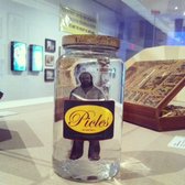
There were three exhibitions up when I visited. One was of a Brazilian artist, Paulo Bruscky, in two galleries. The first one featured works where the artist inserted himself in maps, urban space, and the postal system with his drawings, collages, and performances. I really liked one piece called "I'm Pickling Myself (1974) where he put a photo of himself in a pickle jar, as well as his experiments putting his head and body parts in a copy machine, a new office technology at the time. It all had a do-whatever, anything-goes spirit. The second gallery was more somber: about the artist's use of medical technologies to record his existence as a biological organism, shuffling through the qualities of life and archives. I liked the work in the first gallery better but the shift in tone was a smart way to highlight the range of the artist's work.
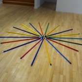
The big galleries had sculptures by Tony Fehrer, which were colorful, simple, ingenious, and delightful. He's the kind of artist who looks at the properties of ordinary things and finds beauty in them. The walls were almost bare, except for some small pieces of cardboard torn off boxes, and so viewers ended up navigating the space by encountering all sorts of assemblages on the floor or hanging from the ceiling, which animated the gallery. Tables of colored glass bottles, filled with various levels of liquid, doodads and washers arranged in a circle--there was a shamanistic aura around this dollar-store detritus. I noticed that several visitors seemed particularly enchanted by a collection of colored mop sticks laid out like a sunburst or a blooming flower.
The last gallery featured photographs taken at a beach in the Bronx. They were large-format, high-quality photojournalistic images. I personally preferred the other exhibits but this was a cool thing to have at a community museum and rounded out the experience with another kind of art-making. Everybody takes photos at the beach so in a way, like the Paulo Bruscky and Tony Fehrer, the photo exhibit is encouraging viewers to find (and make) art in everyday life and that's great.


| 1 to 3 of 3 |

"it's funny because it's true"
- 55 Friends
- 102 Reviews
- 3 Review Updates
- 40 Firsts
- 4 Tips
- 22 Fans
- 8 Local Photos
- 2 Lists
-
Rating Distribution
- View more graphs »
Review votes:
345 Useful, 242 Funny, and 223 Cool
JACKSON HEIGHTS, NY
Yelping SinceFebruary 2012
Things I Loveart