
Brian D.'s Profile
Recent Reviews
102 Reviews
-


As I begin to write this I'm thinking about all the things I've seen and heard at Issue Project Room, both in their old location at the old can factory in Gowanus and their new digs in a stately bank building in downtown Brooklyn.. and the sheer diversity of the offerings here boggles the mind. I can remember a quartet of electric guitars playing incredibly loud experimental contrapuntal pieces, installations of drone-making devices, extremely rude and dirty performance art, a marathon performance of a Milton Friedman string quartet.. if it's live and edgy and and electronic and weird, Issue Project Room is a good home for it.
I went there last night for the first time in a while (I heard they had problems securing the vaulted roof of the bank, and were closed for renovations) for an evening of "internet as poetry." I wasn't in the best disposition for it.. there was a torrential downpour outside, and my feet were totally drenched, what's more because I'm about to leave the country for two weeks I stopped buying groceries a week ago and I've been trying more restaurants in my neighborhood, last night I tried a Chinese place, New Peking, that looks totally run of the mill but had great reviews on Yelp--I'm not sure what these people were thinking, my sesame chicken was totally normal, which means heavy with sweetness and stickiness and fat, not in a great way, so I felt bloated and dazed when I arrived at Issue Project Room all wet. I tried to mitigate the effect with a large can of grapefruit radler ($6) but I think that just made it worse. The first act was Bunny Rogers, who was not only reading from her poems but singing and dancing and displaying a sculpture, two pastel wicker chairs that were woven kitty-corner to each other. There were dramatic costume changes--from Disney princess get-ups to a lounge lizard white leisure suit. Plus, a live piano player on a baby grand! Certainly not your average poetry reading. The poems were good too, though I wonder if all the drama of the performance distracted from the reading part, rather than enriching it. After a brief intermission, during which I guzzled water but still felt like garbage, was Kevin Bewersdorf, who is notorious, apparently, for not using the internet for five years. But now he's back on it, and read some poems--a slammed a few, freestyle--contrasting the ideas of the web (soft) and the net (hard). "babies are perfect. babies are on the web" I noted on my phone, transcribing his words, and I still don't know what they mean, but it sounded cool. He didn't really seem to know how to read into a microphone well and a lot of his words got lost, in fact I think my favorite part was the very beginning when, un-amplified, he made a Santa Claus "ho ho ho" that boomed in the old bank's vault. Christmas in July!
Speaking of which.. the space doesn't have any ventilation or AC that I could discern which makes for some sweaty summer nights.. so i might wait til yuletide to return.
p.s. I love the multicolored stretched fabric parallelograms hung around the room.. it's just for acoustic purposes, but it looks like a cool show of monochrome paintings! -

This hotel is fine. My parents stayed there when they visited New York in 2005, I think, and they didn't have any problems with it. More recently I was there for a presentation of.. art? products? I don't know, by Cory Arcangel. Renting out a conference room on the second floor, the event was billed as a presentation of "surfwear," clothes to wear when surfing, not the waves but the internet--pretty standard T-shirts. But there were other things there as well, sheet music related to conceptual performance projects, some electrici tiki décor, like plastic glowing palm trees and icicle lights, a DVD tower full of shitty 90s comedies (Happy Gilmore etc.), a stack of books about contemporary art and how it's shown.. not to mention the DJ table, and the free donuts and coffee from Dunkin Donuts on a folding table and a mini-fridge, branded Coke, but stocked with Nice brand water from Duane Reade. Everything about it was aggressively average, low/middle brow--and I suppose the hope was that amassing all that in one palce (which is itself totally bland--a Holiday Inn conference room!) would eventually transcend it, concentrate it, make it special, but that's not what happened. It was just boring, textureless. Maybe the artist wanted to bore everyone.. certainly the grossly too-full-yet-undernourished feeling one gets after eating two Dunkin Donuts donuts was a bodily feeling that matched the aesthetic impression... I Can't figure out if that's an artistic achievement or what. After a while I moseyed over to the bar, conveniently located just outside the conference room in the second floor lobby, because the event was dry and I needed a martini. The drink was good but the bartender was slow and kept disappearing for long breaks, so I was glad I was the first attendee of Cory's event who decided (around 3:30 pm) that it was time to drink. I was originally planning to give this three stars but now that I've written it out I realize that nothing says it better than "meh" so, two stars.
-

This is one of New York's great neighborhood museums, and it's been on a roll lately with a series of adventurous group shows detailing the far-out regions of black artistic imagination. There was one about Afrofuturism, science fictions, utopia/dystopia in the winter, and on my last visit I saw "When Stars Begin To Fall," about folk and vernacular art and how the visual language of that has influenced "professional" artists. i want to put the last part in quotes because the exhibition as a whole makes you wonder what that even means, especially when the unprofessional work, in many cases, looks better. There's just a freshness or spontaneity or freedom about it that lots of artists have a hard time preserving when they go through the system of schools and galleries and adapt their vision to conventions of mediums and art histories--things that folk artists never have to think about, unless of course they want to--though of course the best artists always manage to do that, and some of them are represented here. I won't detail everything I saw, but one particularly memorable installation was by Jacolby Satterwhite, who framed and hung drawings by his mother (an "outsider artist" of sorts) of strange variations on familiar household objects, over a wallpaper he made of 3D digital renderings of those objects, alive in a raucuously colorful montage landscape that he imagined around them. It felt like the heart of the whole exhibition, a place where the relationship between folk arts and the world of museums was an intimate, familial one of loving kin.
I'd like to give the Studio Museum five stars but the architecture of the galleries is not that great. The central gallery has a plopped-down feeling that makes work installed there feel random, and it's wreathed by a balcony of uneven width. The narrow corridor on the balcony's east side is always used for small shows unrelated to what's going on around it, and the shape of it (one long wall) poses a real challenge for anyone who wants to develop a story in art that's more complex and compelling than a this-then-that, one-after-another sequence. The balcony also casts shadows, or maybe it's just the yellowness of the lights they use that make everything feel dimmed. Anyway, I realize these are not simple problems to solve, and despite them I will keep coming back to the Studio Museums and doing my best to enjoy the great exhibitions here. -

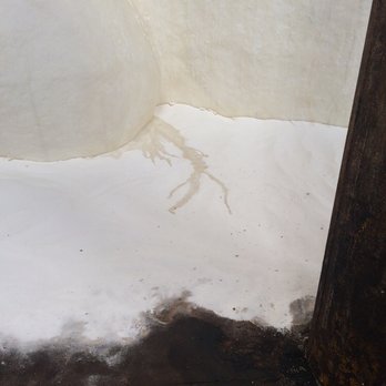
I've never been to Egypt but I can imagine how the mystery of seeing the Sphinx rising from the desert is somewhat mitigated by all the trappings of the tourism industry around it--tour guides, the lines, souvenir stands, finding bottle water, etc. Postcards and pictures make it look like an Ozymandias experience of encountering ancient history amid the sands but I'm sure the real experience is more tightly managed. That's how it is with the mammy sphinx at the Domino Sugar Factory, "A Subtlety" by Kara Walker, where you wait in a long line (fast-moving, but took me about 45 minutes to go three blocks on a Friday afternoon) and then sign release forms absolving the organizers of any guilt should you inhale an asbestos and then go inside, where there are guides observing you and you're surrounded by tourists, people posing and snapping the object, which is so huge and mysterious albeit somewhat detracted by all the hullaballoo I've just described. I've read a lot of articles about how, although this work deals with the legacy of slavery and racism, most of the people who go to it are white and they take goofy pictures pointing at the sphinx's ass and so on, but when I was there were a lot of people of color and though everyone was taking photos of the sculpture they seemed to me to be posing solemnly, not silly--I remember one man who dropped to a half squat and pointed a sober, thoughtful gaze at his friend's phone, holding it for two or three minutes while his friend staged the perfect shot. So, maybe reports were sensationalized, or maybe I just lucked out to be there on a day when the atmosphere was chill, and people were taking pictures not to make light of it but because that's all people know how to do when confronted with a monumental sublime moment, the enormity of an important piece of art that will later dissolve, the importance of it swells their longing to capture it in an image and tag themselves to that moment to think of it again later. I couldn't resist getting a photo either but it all seemed too big to fit on my iphone so I just got some details of the dirty sugar at the sphinx's feet, the lodes of impurities lodged in her sugary flesh like dirt in shoveled snow.
-

I came to Andrew Kreps with great expectations as a fan of Darren Bader's work but this show--or three shows, he says it is--left me sighing with a tinge of melancholy. Bader is a sculptor, I would say, and what I've liked about his work in the past was the feeling of an organic synthesis forging a deeply resonant and closeknit connections among disparate objects, while employing unexpected materials such as animals, living plants, dead vegetables among images and products and the other usual elements of sculpture today. It's a really thrilling sculpture that electrified the space around it, making all the environment alive and me excited to be in it. Or it was.. now, in this show at Andrew Kreps, the materials are atomized, disconnected, and the space of the gallery is just ordinary gallery white space that's there to separate objects and set them apart from my life and life outside. The walls, floor, and air were there between things to isolate them from each other, and isolate me from them.
It was a show of photographs and objects--photos on the wall, objects on the floor. (Already a significant separation, a categorization keeping everything apart in its own conceptual cubbyhole.) For the most part the photographs don't have a lot going on in them, or at least not anything that really caught my interest. They look like fashion shots or ads or stills from movies I wouldn't want to watch in full. And they are framed in black on white walls, very isolatory. The objects, as I said, are all on the floor, some of them are plain like a can of beans whereas a limited number are big and crazy--a panel printed with a weird text about celebrities along with collaged images, which appeared to be a full-fledged work of art in its own right, and a big plexiglass box with black rubber gloves reaching inward, perhaps a kinky torture chamber of some sort? These were interesting to look at but looking at them only reminded me of the plainness of all the rest of the objects, how little there was to link any of them together, just this analytical picking and choosing that just repeats what any gallery in Chelsea does instead of transforming it and making it a worthwhile space to be in. -
It wasn't so long ago when the Lower East Side galleries were the place to see delicate and minor works--drawings, photo collage, or little assemblages of whatever with garbage dangling off. But those days are quickly receding into the past as LES galleries move into bigger digs and put on more ambitious shows to hold onto the yougn artists they've been working with who want to make granger gestures. "More weight" by Sam Moyer at Rachel Uffner is exemplary of this trend. This is a heavy show indeed. I felt like I was at Paula Cooper!! Maybe it was even too heavy for me--Sam moyer's studies of stony textures is so cold, but tactile touches warmed it up. The main gallery is impressively vast and cave-like in its current dimly lit state, a great rock slab taking up most of the floor and a warm off-white luminescence from a stately marbled lightbox of commensurate size on the ceiling. It should be said that the architecture of the gallery itself, which is beautiful, lends a lot to the effects of the art, with white wooden beams, dark floors, a rich lived-in old feel to all the walls and materials. But what I liked best were the smaller works on the upper level, the unevenly cut small rock slabs jointed with textiles stretched on uneven frames. The ancient grooves of geological movement improvised with the quicker, newer lodes of dye in fabric, and what I liked best was how this play of texture and surface continued through the slanting skylight above, which showed the rise of the building next door and the winding paths of vines and cracks as if an extension of the works on view. Made me feel small, and light, in a good way.
-

I didn't spend long at Jayson Musson's show here before leaving in disgust. This collection of truly terrible art is presented with a knowing sneer, making it an unfunny joke of a show that makes fun of everyone but the artist, when it's really he who should be the butt.
The walls feature some stupid abstract painintg: discrete pastel blobs sitting flat on the surface, absolutely no movement or volume or life at all in them. These are just static ugly decoration. Scattered around the floor there are some cartoonish sculptures, which for all their real volume are so toy-like and boring they might as well be flat. It's all just a caricature of what some rich guy with childish tastes might put in his house. There are some screens in the front window and along the stair leading down from the front desk to the gallery with messages in a Comic-sans-looking font, saying things like "Art Museum Next Door!" "Exhibition of Modern Art!" and so on, which implicitly compares Salon 94 itself to those tables outside the Metropolitan Museum or MoMA selling souvenir prints and overpriced postcards--I took it as a rib at Salon 94 for (arguably, somewhat tackily) moving into a space right next door to the New Museum to heighten its own profile. I wonder, what was the conversation between artist and dealer like when this piece was proposed?!
A friend told me that I should check out the press release and learn about the critique that the artist was intentionally hiding in the work, but screw that. That would just be capitulating to the requirements of bad modern/conceptual art that the artist seems to hold in such low regard even as he is exploiting them to his own personal benefit in order to shit on viewers, collectors, dealers, other artists. There is nothing visually or physically interesting about this art world joke that would make it redeeming or sympathetic and I wish that, since the artist obviously hates art so much, he would just give up, go away, stop it, leave me alone. -
Franklin Evans' show here is called paintingassupermodel which could mean painting gets photographed, looked at, admired, airburshed, photoshopped, has its pores removed and so on. But painting here is still a mess: thick, complex, riddled with rough textures, covered with masking tape and confused with print. When it's photographed it's distorted, stretched into wallpaper, blown up too big so the pixels show, or the editing tools otherwise show in ways that aren't pretty. But maybe I'll never understand what Franklin Evans was thinking when he chose this title for this epic installation and that's ok, the title doesn't really matter anyway. What I liked about it was how it shook up perceptions of two-dimensional space, creating a variety of ways of looking at and relating to images on a wall, by mixing prints and collage and painting, inverting one through the other and mashing them all up. It's a fun journey through the artist's process of looking at paintings and making them, with some references to data and web pages and excel spreadsheets in the form of wallpaper that reminds you of computers and offices and networks and markets, the numerical atmosphere that art is made in and exhibitions are organized in, but not in a way that's boringly archival or demands calculating examination on the viewer's part. As I approached the desk to check out the press release a man behind it, barrel-chested in a pink oxford shirt, said "hey how's it going" in a gruff but amicable way that made me feel welcomed.
-

I don't want to sound snobby but I have to say what I feel: Espresso 77 would be a hip local coffee shop in most American cities. In New York it feels suburban to the point of being quaint. I can't think of how to say this without sounding like a snob, which is a shame because I really don't want to sound condescending. i love Espresso 77 and the atmosphere around it is what makes living in Jackson heights so great--the slow, suburban, neighborly atmosphere in the midst of a vibrant urban area.
I'm not picky about coffee but I drink it enough to know what's good, and the coffee here isn't amazing but it's fine. As other reviewers have noted, service isn't amazing either but you get what your order and that's what counts. It's popular, but whevener I want to have a seat to read or work I find one. Espresso 77 has a subscription to Artforum so usually near the beginning of the month I'll come in to leaf through the magazine and see what's up. At night they serve beer and wine, so it's a chill place to have a drink in an area with a dearth of bars (excluding the gay bars and the straight ones where you pay a few dollars to slow-dance with a senorita). There's live music, and though I've never attended I concert I often walk by (I live on the street a block up) and see a crowd enjoying it.
In keeping with the small-city coffeeshop tradition Espresso 77 has changing exhibitions of works by local artists. And to be frank a lot of them aren't that good. I remember a show in the fall of paintings where the people held umbrellas and the rain flowed around them--they were corny in their obsession with the perfect shape of the umbrellas, the unmuddy hues of skies and coats despite the rain. A simplistic fantasia on the umbrella's bouncing rim and round crown. But a more recent exhibit my Pascal Jalabert really impressed me. I'm pretty sure it was the first time I've seen an art show in a coffee shop that responded to the whole space--a total installation that took everything into account. There were landscape/architectural drawings--contour maps from a bird's-eye view of forests and cities, rendered in soft pencil colors, with red bridges in them. They were hung in the wall in a gently sloping arc, like the span of a bridge. And then there was a cardboard-and-foil red bridge spanning the coffeeshop itself, from one wall to the other reaching over the heads of patrons. Exhibitions have changed several times, but the bridge is still there.
I also like the row of exotic theatrical masks that are permanently installed above the window, and the funny art in the bathroom -

Another Kay Rosen show here, and I must say my impression this time was much improved. This time the texture of the wordplay drawings was more unified, and all of the letters in them were starker and more architectural which gave the exhibition an overall feel that relieved the sense of monotony I has previously experienced. Great to see a more continuous relationship between work and space though it's still not my favorite art


2 Lists

"it's funny because it's true"
- 55 Friends
- 102 Reviews
- 3 Review Updates
- 40 Firsts
- 4 Tips
- 22 Fans
- 8 Local Photos
- 2 Lists
-
Rating Distribution
- View more graphs »
Review votes:
345 Useful, 242 Funny, and 223 Cool
JACKSON HEIGHTS, NY
Yelping SinceFebruary 2012
Things I Loveart