
Brian D.'s Profile
All Reviews
102 Reviews
| 31 to 40 of 102 | Go to Page 1 2 3 4 5 6 7 8 9 ... | Previous | Next |
-


I went here to see the work of Jon Rafman--an interesting exhibition about loss and obsolescence and grief, presented in connection with media and gaming and a pre-internet childhood. The most outstanding work was an installation in the back--set up like a teen guy's bedroom that had been abandoned, blown out into a ruin, everything covered with a thick coating of gray dust that made the posters on the wall unreadable, the monster and superhero figurines on the shelves indistinct. Viewers are welcome to sit on the beanbag chair or the desk chair in the installation (don't worry, you won't get dust on your pants, even though the dust looks fresh and real) and watch two videos--the monitor by the beanbag shows footage from a Street Fighter tournament, with internet comments on a running line at the bottom of the screen, and another one with a short film about the nostalgia of a former teen gaming champion that mixes animation of a Blade Runner-type world with old documentary footage of kids at arcades. Very moving, and the installation fit the two videos together nicely. I also liked the series of busts in the front gallery: heads that were misshapen, in a kind of plastic; like the gaming-related works they allude to a kind of heroism that has been obscured and distorted.
What I thought were the weakest pieces were the area around the front desk, with racks full of empty DVD cases--a rather obvious gesture toward the phenomenon of media obsolecense, and the prints made for the covers were not particularly compelling (not sure if the artist made them or if they were found)--and the row of big anime-babe pillows on the back wall of the front gallery, which seemed like a non-sequitur, lacking the elegiac grace that distinguishes other works on display. Just tacky "art fair art".
Printed matter accompanying the exhibition was a deft compromise between an expensive catalogue and a throwaway one-page press release--a free newspaper containing some stories about the closing of the City of Heroes and Everquest MMORPG gameworlds and memories about defunct malls sourced from deadmalls.com. The recollections of past fun complement the main themes of the exhibition, and the newspaper format, related to but separate from any work in the gallery, emphasizes how this is about feelings that can be evoked by media but aren't restricted in any single object--they can be attached to certain things temporarily but they're mobile. I disagreed however with the introductory essay in the newspaper (which was written by one Sandra Rafman... the artist's mom? lol) which was about "The Archival Impulse" in Jon Rafman's work. This suggests that Rafman is interested in how information is collected and stored. But while he uses searches and the frameworks of online forums and databases for his research, I think of his work as actually having an anti-archival impulse, because he doesn't end up displaying the data systems but rather stories about them, or memories about the loss of them, etc. The archive (like the mall, or the arcade machine, or the DVD) is a technology for organizing information that can become obsolete, and I think what Rafman is interested in is the feelings that outlast them. -

I live in a city and when I go to a suburban CVS I expect it to be vast and roomy. This one was, to be fair, in "downtown" Princeton, but it was long, narrow, and crowded-feeling. The aisles were cut in half and "stacked" in rows, so half the aisles were in the front, and the rest were behind them. So it took me a while to figure out where to go to find what I needed (pens, they were in the far back corner).
A weird thing about suburban CVS is that there are no humans at the register. There's a register counter but it's deserted. There is just one human, a greeter, and three automated self-check-out registers - this they don't have in the city because they don't trust people not to steal stuff, I guess. I'm not used to this set up and it really bothered me--the human greeter standing there to be this machine of emotion, just producing a good mood by uttering pleasantries, while the actual work of the transaction was done by the customers themselves at the terminals. I felt really bothered about what's happening with jobs and automation and when I finished paying for my pens and the greeter said "have a good day" I didn't even turn to look at him, I just turned to the exit and left. I just wanted to try pressing the wrong buttons on the emotion machine to make it feel bad.. it was mean, and I knew it was mean when I did it but I did it anyway. I'm sorry. -

Have you ever felt elegant as you exited a parking garage? I did at the Hammer, which has my favorite architecture of any museum I've ever been to. The airy, gracious atrium leads up the main enfilade of galleries that encircle a courtyeard, connected by a broad balcony. Only in southern California, I suppose, could a museum have its visitors going outdoors between each exhibit. The far side of the balcony had some very cool-looking deck furniture for lounging in, and two ping-pong tables. Fun!
There was a great variety and quality to the exhibitions. My favorite was the comprehensive exhibtiion of the fascinating painting of Forest Bess - which presented his idiosyncratic ideas about gender and spirituality in a really accessible way, and just gave me a chance to look at the way he developed his philosophy of colors and mark-making and symbols, to approach painting as the creation of a new other world. There is some great stuff in the permament collection galleries--several drawings and bronzes based on them by Daumier, the 18th century caricaturist, who drew the ascendant bourgeoisie of his time as weird monsters whose faces are just emerging from a gooey flesh mass. I love him! I also enjoyed the retrospective of James Welling, a conceptual photographer who came up with various ways of using photographic technologies to produce abstract images rather than indexical ones. I like the colors of those photograms and gradients but some of his later work, shot in libraries, looks dull. I really hate conceptual art with old books in it. The artist is just like "look how smart I am" and I could care less, honestly.
I also wasn't really into Tacita Dean's film, about the Spiral Jetty, which had some spiral-jetty-shaped cuts in the film, a cute gesture, but why make art about other people's art? I just don't get that. Then a show of a contemporary artist (I want to say her name is Kelly Crowland but now I'm realzing that can't be possible.. it was definitely Kelly something), with letters sewn on bags of rice, was not interesting at all but you win some you lose some, right?
On the way out I noticed a gallery near the entrance that theoretically one could visit without paying for entry, because you don't have to pass the admissions desk to get there. The show there was a video about interrogation techniques--seemed a little heavy-handed to have the free gallery featuring "socially engaged" art but I nice gesture I suppose. -
 1040 Grand Concourse
Bronx, NY 10456
I've lived in NYC for six years but I only made it to the Bronx Museum a couple weeks ago, and wow. What a great little museum! I feel guilty admitting this but I was not expecting to enjoy it so much. After visiting I really feel certain that the "neighborhood" museums (Studio Museum in Harlem, Queens Museum, and this one) are the best places to see art in New York--not as sterile or predictable as the famous ones in uptown and downtown Manhattan.
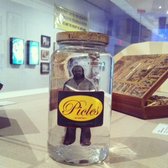
There were three exhibitions up when I visited. One was of a Brazilian artist, Paulo Bruscky, in two galleries. The first one featured works where the artist inserted himself in maps, urban space, and the postal system with his drawings, collages, and performances. I really liked one piece called "I'm Pickling Myself (1974) where he put a photo of himself in a pickle jar, as well as his experiments putting his head and body parts in a copy machine, a new office technology at the time. It all had a do-whatever, anything-goes spirit. The second gallery was more somber: about the artist's use of medical technologies to record his existence as a biological organism, shuffling through the qualities of life and archives. I liked the work in the first gallery better but the shift in tone was a smart way to highlight the range of the artist's work.
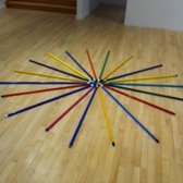
The big galleries had sculptures by Tony Fehrer, which were colorful, simple, ingenious, and delightful. He's the kind of artist who looks at the properties of ordinary things and finds beauty in them. The walls were almost bare, except for some small pieces of cardboard torn off boxes, and so viewers ended up navigating the space by encountering all sorts of assemblages on the floor or hanging from the ceiling, which animated the gallery. Tables of colored glass bottles, filled with various levels of liquid, doodads and washers arranged in a circle--there was a shamanistic aura around this dollar-store detritus. I noticed that several visitors seemed particularly enchanted by a collection of colored mop sticks laid out like a sunburst or a blooming flower.
The last gallery featured photographs taken at a beach in the Bronx. They were large-format, high-quality photojournalistic images. I personally preferred the other exhibits but this was a cool thing to have at a community museum and rounded out the experience with another kind of art-making. Everybody takes photos at the beach so in a way, like the Paulo Bruscky and Tony Fehrer, the photo exhibit is encouraging viewers to find (and make) art in everyday life and that's great. -

I didn't spend long at Jayson Musson's show here before leaving in disgust. This collection of truly terrible art is presented with a knowing sneer, making it an unfunny joke of a show that makes fun of everyone but the artist, when it's really he who should be the butt.
The walls feature some stupid abstract painintg: discrete pastel blobs sitting flat on the surface, absolutely no movement or volume or life at all in them. These are just static ugly decoration. Scattered around the floor there are some cartoonish sculptures, which for all their real volume are so toy-like and boring they might as well be flat. It's all just a caricature of what some rich guy with childish tastes might put in his house. There are some screens in the front window and along the stair leading down from the front desk to the gallery with messages in a Comic-sans-looking font, saying things like "Art Museum Next Door!" "Exhibition of Modern Art!" and so on, which implicitly compares Salon 94 itself to those tables outside the Metropolitan Museum or MoMA selling souvenir prints and overpriced postcards--I took it as a rib at Salon 94 for (arguably, somewhat tackily) moving into a space right next door to the New Museum to heighten its own profile. I wonder, what was the conversation between artist and dealer like when this piece was proposed?!
A friend told me that I should check out the press release and learn about the critique that the artist was intentionally hiding in the work, but screw that. That would just be capitulating to the requirements of bad modern/conceptual art that the artist seems to hold in such low regard even as he is exploiting them to his own personal benefit in order to shit on viewers, collectors, dealers, other artists. There is nothing visually or physically interesting about this art world joke that would make it redeeming or sympathetic and I wish that, since the artist obviously hates art so much, he would just give up, go away, stop it, leave me alone. -

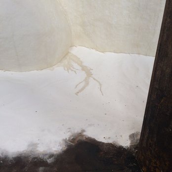
I've never been to Egypt but I can imagine how the mystery of seeing the Sphinx rising from the desert is somewhat mitigated by all the trappings of the tourism industry around it--tour guides, the lines, souvenir stands, finding bottle water, etc. Postcards and pictures make it look like an Ozymandias experience of encountering ancient history amid the sands but I'm sure the real experience is more tightly managed. That's how it is with the mammy sphinx at the Domino Sugar Factory, "A Subtlety" by Kara Walker, where you wait in a long line (fast-moving, but took me about 45 minutes to go three blocks on a Friday afternoon) and then sign release forms absolving the organizers of any guilt should you inhale an asbestos and then go inside, where there are guides observing you and you're surrounded by tourists, people posing and snapping the object, which is so huge and mysterious albeit somewhat detracted by all the hullaballoo I've just described. I've read a lot of articles about how, although this work deals with the legacy of slavery and racism, most of the people who go to it are white and they take goofy pictures pointing at the sphinx's ass and so on, but when I was there were a lot of people of color and though everyone was taking photos of the sculpture they seemed to me to be posing solemnly, not silly--I remember one man who dropped to a half squat and pointed a sober, thoughtful gaze at his friend's phone, holding it for two or three minutes while his friend staged the perfect shot. So, maybe reports were sensationalized, or maybe I just lucked out to be there on a day when the atmosphere was chill, and people were taking pictures not to make light of it but because that's all people know how to do when confronted with a monumental sublime moment, the enormity of an important piece of art that will later dissolve, the importance of it swells their longing to capture it in an image and tag themselves to that moment to think of it again later. I couldn't resist getting a photo either but it all seemed too big to fit on my iphone so I just got some details of the dirty sugar at the sphinx's feet, the lodes of impurities lodged in her sugary flesh like dirt in shoveled snow.
-
Family Business is a new gallery. I wish I could say it looked promising. When I went in mid-April there were at least a hundred works on display in a tiny space, crammed so tightly that it was hard to look at anything. When I did manage to focus my attention on a single piece it was weak, undergrad-level work.
There are dozens of places in Chelsea to see decent art in favorable installation conditions. Don't waste your time here. -
Art about architecture seems pretty hot right now and Nicelle Beauchene had an exhibition of photographs of buildings by Chris Wiley. The images framed parts of modernist buildings that had become worn down, discolored, covered up with trash. All the images had clear geometric lines of perspective that were disrupted just enough by everyday wear-and-tear. Everything was cool and aloof and depopulated. Overall the show was easy on the eyes but nothing special. Two of the best images were hanging in the office--a bit of an odd choice because a lot of gallery visitors are probably too shy to peek in an office but I guess if that's where the actual clients go you want to impress them.
On the artist's CV it says that Chris Wiley is an art critic who has published his writing widely. He wrote his own press release and I remember it being more fun to read than the usual press release but it didn't give me a fresh perspective on the work. Still, I think it's a good idea for galleries to have artists write their own press releases--even (or especially) if they aren't critics. -
I went to Spinello Projects on opening night of Manny Prieres's exhibition: graphite drawings on black paper of covers of banned books, from the Bible to Salman Rushdie and Daddy's New Roommate. These were small, not-too-expensive works that look good in any minimal apartment and have an air of bookish importance that turns them into easy conversation-starters. The show was obviously calculated to sell by looking slick while capitalizing on cultural conflicts--in very poor taste, if you ask me. It got worse on the second floor, where in addition to the book covers there were slogans drawn in the same technique, including "Work will set you free," from the gates at Auschwitz. Gross. It's a cool space though.
-

Found video footage shows up in a lot of art these days, but Trisha Baga adds another dimension to it--literally! One of the pieces in her show at Greene Naftali had Olympic athletes, and fireworks, stadium concerts, and stuff that looked camera-test footage from YouTube spliced together in an order determined by the artist's private network of associations. But because the images were extruded with 3D techniques it felt less introverted and subjective than a lot of the poetic video montage I've seen in the last few years. When the runner lunged toward me in his warm-up stretch and the soundtrack surged it was hard for me not to feel engaged, even though I wasn't really sure of what the image meant. There was also another 3D video, an animation with characters in conversation, and it required a different set of glasses. Signs on the walls noted that the glasses were "specially synced" to each video. There's not a time component to the way the glasses work so "synced" is not the right word, but I understood what they meant and was very impressed by the technical work that went into preparing the videos. More importantly, the different sets of glasses gave the videos a sense of being anchored in space: you really had to move into their zone and stay there for a while with the glasses on in order to appreciate a work. Maybe Baga's next step is virtual reality helmets! (Just kidding... although, who knows?) The whole gallery was darkened, and viewers had to navigate the various glowing sections between and around the two main projections. There were some sculptural video installations to walk through, with projections bouncing off plates or through pieces of broken glass, and weird little assemblages without any digital components just cluttering the floor. These pieces related the digital moving images to everyday objects in a way that suggested a bodily presence for the video without relying on the technological novelties deployed in the 3D works. I doubt they would look that great on their own, with the lights on, but they really added some depth and fullness to the show as a whole.
I'd say Trisha Baga's show was a four-star experience for me, but thinking back to some of the great exhibits I've seen at Greene Naftali in the last year I have to give the gallery five stars overall. This fall Gelitin put big weird sculptures on pedestals that were rigged so when people pushed levers or buttons on them (as they were invited to do) the sculptures fell off and crashed on the floor. I missed the opening so I didn't get to see the sculptures in their original, untarnished state, just the wreckage several weeks later. So often when messy art gets put in a Chelsea gallery, the installation sanitizes and sterilizes it, putting ugliness and failure on a pedestal for people to ooh and aah at. That always makes me feel a little queasy. Gelitin knocked ugliness and failure off the pedestal--literally!--and when I walked through the gallery I felt like these qualities were all around me, fresh and nasty and alive. Then there was Haegue Yang's show last spring, of her hanging sculptures assembled from Venetian blinds, cameras, and light bulbs. This had a totally different feel than Trisha Baga and Gelitin's lively and funny exhibitions-- it was beautiful, ethereal, serene. As I moved around the sculptures the light skipped down the blinds, and the angles of the camera lenses reminded me of the limits of my perspective. Greene Naftali is on the eighth floor a building, which makes it more of a hassle to get to than Chelsea's sidewalk-level galleries--you have to ride up in an antiquated elevator with an operator and there's usually a bit of a wait. There were times when I thought about going to see an exhibition there but skipped it because I knew it would take so long. But when I looked out the big windows at the city skyline and Hudson River nearing dusk and saw the soft light coming in and filtering through Haegue Yang's sculptures, the high location no longer seemed like a drawback. It can actually be a huge plus.


| 31 to 40 of 102 | Go to Page 1 2 3 4 5 6 7 8 9 ... | Previous | Next |

"it's funny because it's true"
- 55 Friends
- 102 Reviews
- 3 Review Updates
- 40 Firsts
- 4 Tips
- 22 Fans
- 8 Local Photos
- 2 Lists
-
Rating Distribution
- View more graphs »
Review votes:
345 Useful, 242 Funny, and 223 Cool
JACKSON HEIGHTS, NY
Yelping SinceFebruary 2012
Things I Loveart