
Brian D.'s Profile
| 11 to 20 of 102 | Go to Page 1 2 3 4 5 6 7 8 9 ... | Previous | Next |
-

I like this bar but I could never give it five stars as it's too damn narrow. I like some elbow room and at Beverly's once the crowd at the bar is one man deep it's hard to walk from one end of the bar to the other without being like "scuse me" "pardon me" and shoving your way past everybody. So it's a nice place to meet up with friends on a week night but I would steer clear on weekends, unless I manage to park myself at one of the lounging areas in the front or back (probably the back, since that's where the bathroom is and I will have to go there at some point anyway). But otherwise I like the design of the place. It's newly built but it's not slick or pretentious, yet at the same time it's not divey either--the furniture is in pretty good shape and it's clean. It strikes a nice balance, like an art gallery with concrete floors and some utilities showing but still neat enough for showing art. I make this analogy on purpose because Beverly's does display some art works. Up front there's a relief panel in styrofoam, backlit with blue and rose LCD bulbs. I'd seen the piece elsewhere and thought it had this effect of otherworldly alien menace yet in the bar context it evoked a timeless downtown neon coolness, with a strange twist--and I liked it more than I had before. The rear lounge area in the back has a giant backwards 2, hewn from wood, under a little canopy of icicle lights. The je ne sais quoi of art pieces like these makes Beverly's feel like a place where you should always be poised for an interesting, open-ended conversation.
-

I saw an exhibition here by Jutta Koether, a painter who likes to apply fluorescent colors with an expressionistic/primitivistic brushstroke. She mixes in some strange material once in a while, too--one painting had pools of clear gelatinous liquid that looked like it had been spilled on there to harden. Also the floor of the gallery was covered wall to wall with gravel the color of dried blood or cedar chips. The contrast of the rusty rocks and the paintings' fluorescent pinks and oranges from a totally different part of the "hot" palette created the kind of visceral gross-out effect that a lot of artists are using these days to try to make painting seem like a relevant and compelling medium. Works for me! Four stars.
-
 1040 Grand Concourse
Bronx, NY 10456
I've lived in NYC for six years but I only made it to the Bronx Museum a couple weeks ago, and wow. What a great little museum! I feel guilty admitting this but I was not expecting to enjoy it so much. After visiting I really feel certain that the "neighborhood" museums (Studio Museum in Harlem, Queens Museum, and this one) are the best places to see art in New York--not as sterile or predictable as the famous ones in uptown and downtown Manhattan.
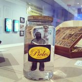
There were three exhibitions up when I visited. One was of a Brazilian artist, Paulo Bruscky, in two galleries. The first one featured works where the artist inserted himself in maps, urban space, and the postal system with his drawings, collages, and performances. I really liked one piece called "I'm Pickling Myself (1974) where he put a photo of himself in a pickle jar, as well as his experiments putting his head and body parts in a copy machine, a new office technology at the time. It all had a do-whatever, anything-goes spirit. The second gallery was more somber: about the artist's use of medical technologies to record his existence as a biological organism, shuffling through the qualities of life and archives. I liked the work in the first gallery better but the shift in tone was a smart way to highlight the range of the artist's work.
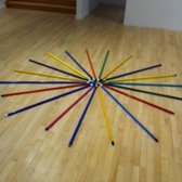
The big galleries had sculptures by Tony Fehrer, which were colorful, simple, ingenious, and delightful. He's the kind of artist who looks at the properties of ordinary things and finds beauty in them. The walls were almost bare, except for some small pieces of cardboard torn off boxes, and so viewers ended up navigating the space by encountering all sorts of assemblages on the floor or hanging from the ceiling, which animated the gallery. Tables of colored glass bottles, filled with various levels of liquid, doodads and washers arranged in a circle--there was a shamanistic aura around this dollar-store detritus. I noticed that several visitors seemed particularly enchanted by a collection of colored mop sticks laid out like a sunburst or a blooming flower.
The last gallery featured photographs taken at a beach in the Bronx. They were large-format, high-quality photojournalistic images. I personally preferred the other exhibits but this was a cool thing to have at a community museum and rounded out the experience with another kind of art-making. Everybody takes photos at the beach so in a way, like the Paulo Bruscky and Tony Fehrer, the photo exhibit is encouraging viewers to find (and make) art in everyday life and that's great. -

This is a very small gallery that shows smart, handsome conceptual work, which is pretty standard for the neighborhood. When I went in April there was a show with pictures of buildings and newspapers clippings and other printed text. It all looked nice but I couldn't quite figure out what was going on, nor did I feel compelled to look close enough at the words to understand it. Fortunately a guy came out of the office and told me that it was about architecture of financial and retail spaces--how banks built neo-classical facades earlier in the twentieth-century to project an image of sturdiness and reliability but are now occupying light-and-mobile looking modernist spaces, while retail companies are taking over the old and weighty vaulted buildings. Very interesting, I was glad that this got explained to me. The artist's name was Jason Simon.
-
Soak or stroke? Stroke or soak? This is the question that continuously, but pleasurably, bedeviled me as I viewed the exhibition of paintings by Matt Connors at Canada gallery. Many of them had thick stripes that looked like the trail of a broad brush drawn briefly along the surface of the canvas but on closer inspection they revealed no trace of brushhair or the direct application of a hand, instead having a wet look suggesting that the canvas had been dipped in wet paint so as to leave a stain. But in some the approximation of a brushstroke shape was so close I could almost see the ahirs tingling at the pigment's edges like hairs on an excited neck! Here and there I would see drips lefts by a splash yet they were so rich and saturated I imagined the paint falling on the canvas in slo-mo like in a commercial for absorbent paper towels. In my favorite painting of the lot the strange soak/stroke stripes--in soft shades of the primaries, red, yellow and blue--danced in a configuration that was architectural but also like a quilt, somewhere between a map's legend and patchwork. Connors' paintings more than any others I've seen lately remind me of mid-century abstraction and its jazzy play of paint on the surface, and yet it's not like the old expressionism at all because it doesn't have that aggressive approach to the plane, instead there's a tender treatment of the canvas saying that the painting isn't just a surface, it's a depth, and I felt my eyes sinking into it, drowning in love for these paintings.
-

Currently on view at Cherry and Martin is a small selection of works by Alan Shields, who I wrote about previously in the update to my review of Paula Cooper Gallery, in New York. To recap, he is a painter from the 60s and 70s who experimented with fabrics and techniques from the realms of crafts. I discovered a new side of his work here--some concrete poems, where he took words from ads or a newspaper, repeated them and mixed them up, and typed them out on a typewriter. It was interesting to know he did that but I prefer his paintings. There was one I really enjoyed at this show, a big rough and dirty canvas with a misshapen grid of splotches, concentrated in color in the center and wetly bulging outward, as if he'd laid out a bunch of watercolor ice cubes on the canvas and let them melt as they will. I don't know how he really made it. I should have asked the people who worked there. They were very nice.
-
Three-word review: L. O. L.
I don't think I've ever laughed so hard in a gallery as I did at Joel Holmberg's exhibit here. This is a good thing. The gallery just had seven monitors with video, plainer than a display aisle at BestBuy, but the content on them was something else.
One of my favorites was "Unattended Macbook Airs in Juice Store, 2013." It's just what the title says it is. Through the storefront window we see a Macbook Air, its screen black from disuse, unattended on a small round table without seating, where one would drink juice standing. The camera zooms in for a closer look--it is indeed a Macbook. A few steps further, past the door, and on the ledge is ANOTHER Macbook, similarly abandoned, black-screened. The camera pans up for a long view of the first computer, from behind, zooming in and then swinging around rapidly for another view back where it started. I think what I found so funny about this video is the voyeuristic quality of peering into windows but without any attention to people, who are usually the object of peeping. (Where are the humans anyway? Drinking juice?) Instead you have the machine eye of the camera scoping other machines. Of course there's a person (Joel Holmberg) behind the camera, but except for the part where he walks past the store door and you glimpse his shoe he's invisible, and the flourish of movement at the end swooping from one window to the next is so fast it seems inhuman. So it's funny to think that machines want to study each other when no one is around. Also, it's crazy that there are two computers just sitting there.
I could go on and on describing all seven videos in the show but I'd run out of space, so I'll just talk about the piece de resistance, which is a collection of shots of people talking on CNN and the labels that say who they are. Some examples I wrote down: "Pete Wilson: Car Hit By Boulder" "Deziray Chick: Filmed Owls" "Amy Corey: Banned from McDonalds" "Nilly Mauck: Condo Trashed" The grammar of how they are described doesn't always matched. It's like dangling modifiers. That, plus the stories people are telling, if you listen (it was kind of hard to hear in the gallery--but I was there at the opening when people were talking) are very ordinary and boring, and that gets you thinking about how CNN is trying to create and sort through so much info, how pointing the camera is one way to get people to talk about themselves, and the person back in the studios writing the descriptions is working from the other side to figure out what to do with it. And the descriptions, when seen one after the other, are just so funny. "Cathy Wunschel: Found Pearl" "Marc Rosenthal: Was Lost In Apple Orchard" Like the juice store video, and the rest of the ones in this show, the collage of CNN footage approached the way humans and technology participate in communication from a fresh and fun perspective and I loved it. -

I went to this gallery to see the Robert Buck show. It had sculptures that reflected the visuals of the southwest U.S. and the Native American experience--lots of concrete and barbed wire and earth-tone paints. It was just OK. But I give it four stars because apparently the artist used to exhibit under the name Robert Beck but changed it to Robert Buck, which is much cooler. Also I love the front doors at this gallery--the handles are thick and square and have a nice burnished copper look. Thanks to the doors, I always enjoy going in and out of this gallery!
-
I live in a city and when I go to a suburban CVS I expect it to be vast and roomy. This one was, to be fair, in "downtown" Princeton, but it was long, narrow, and crowded-feeling. The aisles were cut in half and "stacked" in rows, so half the aisles were in the front, and the rest were behind them. So it took me a while to figure out where to go to find what I needed (pens, they were in the far back corner).
A weird thing about suburban CVS is that there are no humans at the register. There's a register counter but it's deserted. There is just one human, a greeter, and three automated self-check-out registers - this they don't have in the city because they don't trust people not to steal stuff, I guess. I'm not used to this set up and it really bothered me--the human greeter standing there to be this machine of emotion, just producing a good mood by uttering pleasantries, while the actual work of the transaction was done by the customers themselves at the terminals. I felt really bothered about what's happening with jobs and automation and when I finished paying for my pens and the greeter said "have a good day" I didn't even turn to look at him, I just turned to the exit and left. I just wanted to try pressing the wrong buttons on the emotion machine to make it feel bad.. it was mean, and I knew it was mean when I did it but I did it anyway. I'm sorry. -

This is a good space. I went during the Art Walk and they had a Quisqueya Henriquez show will collages and prints: op-art lenticular effects, shimmery pixelated screen shots, digital renders of architectural fragments, sticky Rorschach-test paintings laid on top of some of the prints. She is taking some interesting ideas that other artists have explored in greater depth and putting them together in her own way. This isn't incredibly exciting but, honestly, that's what most art is and at least Quisqueya Henriquez has a nose for what's relevant.
Tip: Don't even look at the press releases. The pretention is over-the-top. You will gag.


| 11 to 20 of 102 | Go to Page 1 2 3 4 5 6 7 8 9 ... | Previous | Next |

"it's funny because it's true"
- 55 Friends
- 102 Reviews
- 3 Review Updates
- 40 Firsts
- 4 Tips
- 22 Fans
- 8 Local Photos
- 2 Lists
-
Rating Distribution
- View more graphs »
Review votes:
345 Useful, 242 Funny, and 223 Cool
JACKSON HEIGHTS, NY
Yelping SinceFebruary 2012
Things I Loveart